In Process is a series that examines the inspiration, methods, and tools used by artists to create their work. Each episode focuses on a specific piece.
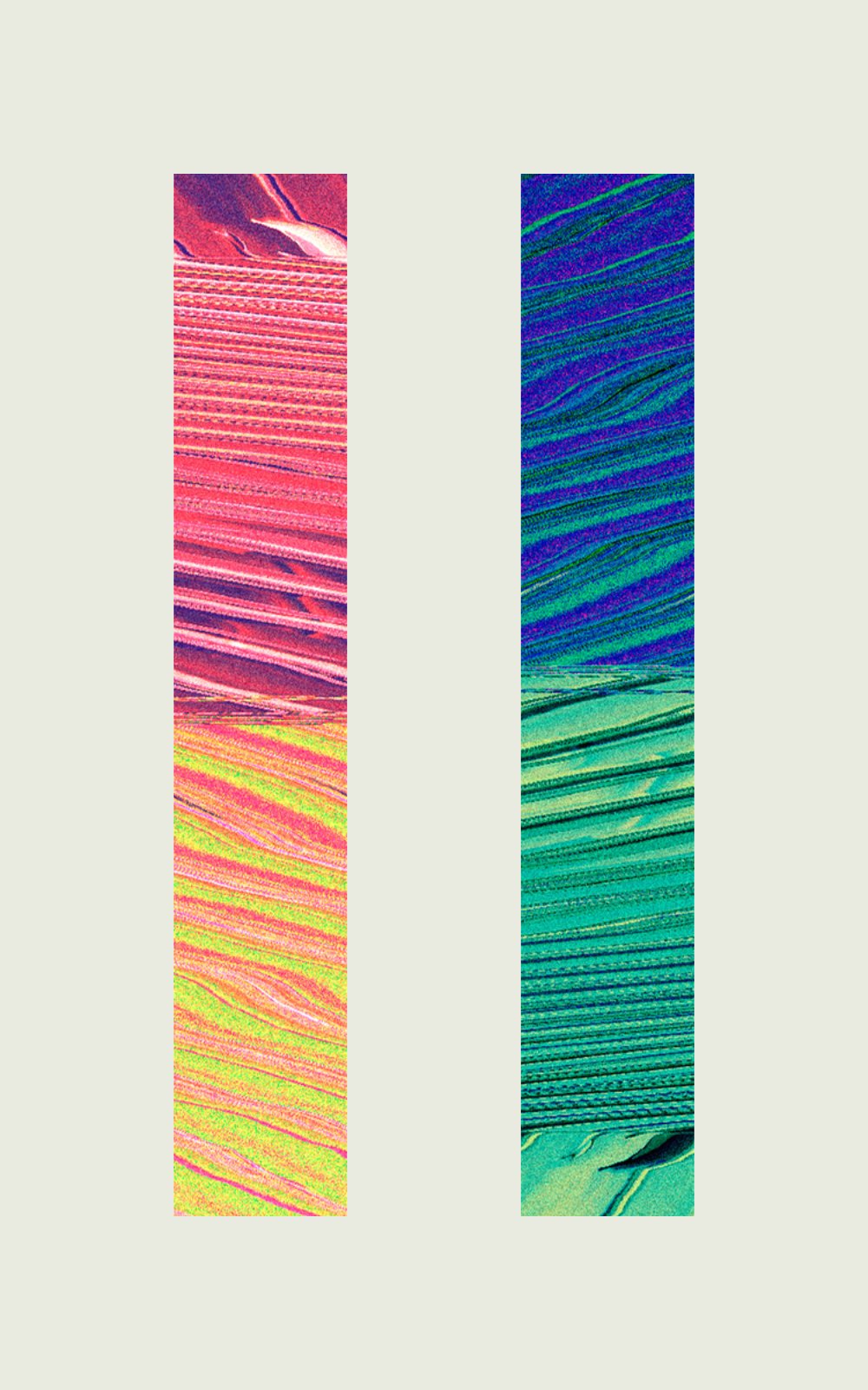
In this inaugural episode, I’ll take a look at difficulty_mode5 (pictured above) by Polyforms (yours truly).
Find all episodes of In Process on the Ep. 0: Index page.
What was the inspiration for the piece?
I’m a little bit of a perfectionist, so I wanted to make a series of pieces that challenged my need for perfection and order.
Each piece would have something that was slightly off-kilter; maybe it’s not quite aligned to the centre, an element was slightly larger or smaller than it should be or there was some kind of unusual framing.
I also really enjoy glitch art and felt like the inherent imperfection of a glitch fit well with the theme of the pieces, so I decided to use glitched-out images as the source for the pieces.
difficulty_Mode5 is the fifth piece in the series.
Describe the technical process of the piece. What medium and tools were most important to creating it?
I began by creating a series of glitched images. This is achieved by opening an image file, like a JPG, in a text editor and scrambling some of the text. There’s a great tutorial on how to do this here or you can just use Snorpey’s Image Glitch Tool.
I intentionally don’t keep many ‘process’ images along the way when I create, so I don’t have the original un-glitched images for difficulty_Mode5, but the image below is the resulting glitched source image, after running it through TextEdit.
Next, I loaded the glitched image into Pixelmator, an image editing tool for Mac, and processed the source image using various colour filters to achieve the colours for the final image.
Pixelmator is a destructive editor, so I can’t see (or remember) exactly which image filters I would have used, but this process is usually very exploratory for me. I’ll just load up a filter and tweak some settings until I get something I like.
Once I’d created two different colour schemes I thought about how to present them. I think that how something is framed can change a lot about how we perceive it.
Normally I’d go straight for a square or landscape frame, but in keeping with the theme for the series, I wanted to try something different, so I set up a 10:16 frame.
At first it felt a bit odd, but I’ve grown to really like the unique framing over time.
The final step was to add some motion to the piece.
I animate all my pieces using Resolume Arena. Resolume is intended as live performance software, but it has excellent built-in effects and filters and I’ve come to know them well enough to get them to do what I want.
I try to keep the animation subtle. This piece was animated using Resolume’s Displace effect.
I’ll export a long chunk of animation from Resolume, then import it into DaVinci Resolve to crossfade between 2 sections and create a seamless loop.
How did the NFT for the piece come about? Did you make this piece specifically for hic et nunc, or was it a piece you'd already made and retrofitted for the platform?
I began exploring NFTs in early 2020. I’ve actually had the pieces for difficulty_Modes for quite some time, since about 2015, but I’d never really done anything with them, so I knew making them into NFTs was a perfect way to revitalise the series.
I’ve minted work on many platforms but hic et nunc has always worked out best for me. There’s a strong community and I also love the minimal HEN interface, which really gets out of the way and lets the artwork shine.
Where can I learn more about your work?
If you want to learn more about this or any of my other pieces or want to know when I publish more In Process episodes you can find me on Twitter.
Drop me a DM if you have any questions 💬


